Playing with Streamlit Framework
Recently I run into this article https://medium.com/@ahmasoh/the-end-of-flask-in-data-science-738920090ed9 in my Medium’s Daily Digest and gave it a try as a professional Flask developer. For my surprise, it seems that Flask is often considered for building Data Science/Machine Learning reports – though Flask is good for web applications, I have a feeling it is too much for whom is not a web developer, Jupyter seems a better fit here.
Anyhow, after reading the article, I really liked the new framework Streamlit. For those in need of displaying data with some interactive tools, this is good. So I wanted to play a bit with Streamlit and see it working through my fingers.
As it is the theme nowadays, I found a repository with updated data for Covid19 in Brazil (kudos for Wesley and the team for keeping this up) that I could use to display something interesting from that data there.
In roughly 2 days, working for the first time with almost all libraries involved, I was able to deploy something on Heroku to display the daily notifications in Brazil per State.
Into the code
The code for the whole page was very concise and simple, the hardest part was to integrate with the viewing framework like Altair (for charts) and Pydeck (for maps). Even the controls for date and type of view are so easy to add and work with. For instance, the commands to add the inputs shown above were:
# Inputs
d = st.date_input("Selected day", date(today.year, today.month, today.day-1))
opt = st.selectbox("Type of view", ['Map', 'Chart'], index=0)

# Display data according to selected type of view
if opt == 'Map':
    show_column_map(filtered_data)
elif opt == 'Chart':
    show_bar_chart(filtered_data)
The magic behind is that when the user changes something in the input field, the application gets reloaded – but only the affected states are really reloaded and this can be even improved with some annotations to prevent re-reading data, for example.
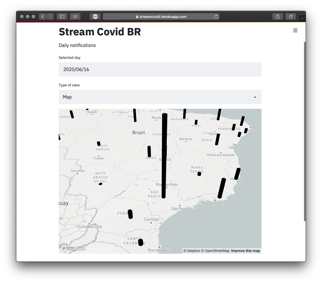
The map
Pydeck is already installed when you install Streamlit, so the only thing needed to setup before is get a token from Mapbox and make it readable by Streamlit. After that, this command will display the map and the columns with the values for each state – and remember, it gets automatically refreshed if the date is changed.
st.pydeck_chart(pdk.Deck(
    map_style='mapbox://styles/mapbox/light-v9',
    initial_view_state=pdk.ViewState(
        latitude=-23.901,
        longitude=-46.525,
        zoom=5,
        pitch=50
    ),
    layers=[
        pdk.Layer(
            'ColumnLayer',
            data=data,
            get_position='[lon, lat]',
            get_elevation='[newCases]',
            radius=20000,
            auto_highlight=True,
            elevation_scale=100,
            elevation_range=[0, 5000],
            pickable=True,
            extruded=True
        )
    ]
))
The chart
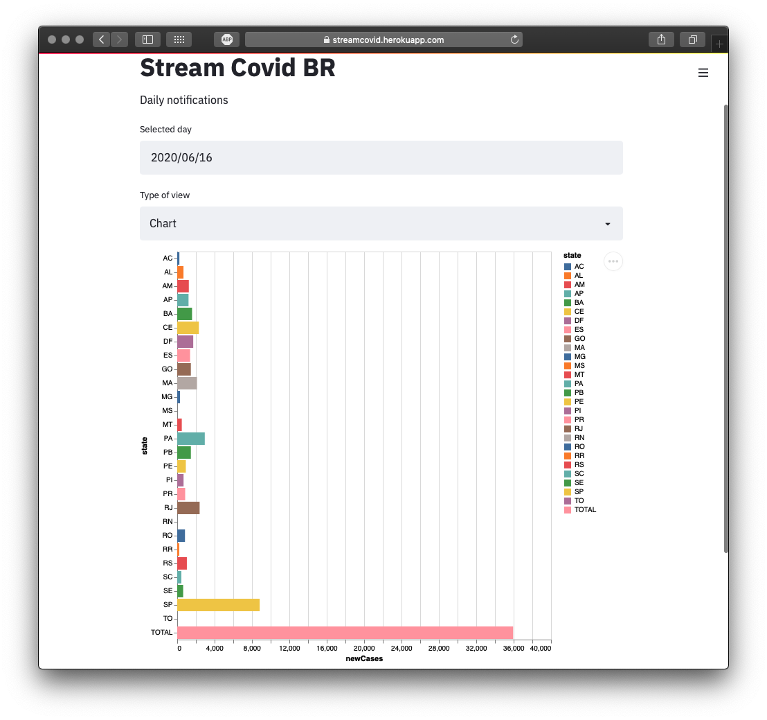 I spent more time trying to decided the more useful chart to have here. I ended up with this horizontal bar chart using Altair plugin. Having the proper data, I won’t go into the Pandas details though, to created the chart is just a one-liner command:
alt.Chart(data).mark_bar().encode(x='newCases', y='state', tooltip=['newCases'], color='state')
        st.altair_chart(c, use_container_width=True)
Conclusion
In the end, Streamlit is really a great tool for turning data into real human information, but it won’t be replacing Flask on classic web development. I guess everybody that is using Flask for Data Science apps should give Streamlit a try.
For my sample application, I may add one thing or another later on. PRs and suggestions are accepted :)
- Repository: https://github.com/gerson23/streamcovid
- Live app: https://streamcovid.herokuapp.com